UI/UX design

DIGITAL TRANSFORMATION AT ERICSSON

Nov 2020 - Mar 2022

OVERVIEW

Ericsson is a world leader in the rapidly changing environment of communications technology - by providing hardware, software, and services to enable the full value of connectivity.

“Imagine that we're building SAP from scratch - it's huge!”. This was a comment told to me at the start when I asked questions about this project. Indeed, it was a very complex and large project which had to be split up into seven areas and use cases. Each use case had one team, so seven teams in total, which consisted of business analysts, subject matter experts, solution/data architects, developers, demand planners, agile coach, and me as the sole UX/UI designer working with the whole design process from concept to development delivery.

All teams used the Ericsson design system, EDS. Results and designs from all the use cases/teams were planned to later be merged into one platform/tool: Integrated Business Planning (this was the working name at that time).
My team and use case worked with Demand Management which was split up in five areas. We focused on one of those areas, Account forecasting, where different roles/users create and review forecasts of the market demand. We worked in an agile environment with 2-week sprints.

GOAL

Digital transformation....but what does this really mean?

ERICSSON GOALS
To be part of the accelerating rate of change in the world through digitalisation and to deliver business capability that drives innovation.

BUSINESS GOALS
Shorten lead times and long processes and increase cost effectivity in the Sales- and Operations Planning, through AI, machine learning, digitalised workflows and world class UI.

USER GOALS
Effective and transparent ways of working for Ericsson employees, centralised and up-to-date information, reduce or remove tedious manual work with the help of digitalisation.


IMPORTANT TO NOTE

Due to this project containing certain internal information that is not allowed to publish openly, I'll only show a few screenshots of the platform itself (parts of the screenshots have blurred text due to usage of real data or name examples). This also means I won't go into detail or show images of the users' work processes in the steps explaining the design process below, so it will only be text summarising my work and problems I solved.

UNDERSTANDING THE PROBLEMS

My work included:

  • Interviews with end users, stakeholders and SME:s(Subject matter experts).
  • Personas
  • Analytics
  • User journeys, both AS IS and future proposed.
Challenge #1
Starting in our team/use case when it was already in prototype phase, instead of the beginning phases of the design process. This project didn't have any UX designers involved before us due to certain circumstances and timing, which is understandable but of course it makes everything very difficult to enter late and be able to solve problems if you don't have a real foundation to build on: there was no empathise/define phase and no real user research conducted, and therefore no material i.e personas or user journeys for us newcomers to study and understand everything - but in the real world not everything can always be laid out perfectly from start, so although the initial struggle I learned a lot as we had to solve things in sort of a different order and way than a "conventional" design thinking and process order. This made it especially rewarding when we still managed to deliver actual value to users!

Solving the challenge
It's always good to speak up and express any concerns about the design thinking process being missed. I asked if it was possible for me to take a few steps back at least so I could actually meet the users and interview them to create personas as a start. When doing this, there will always be a risk that some people may be very reluctant and not understanding why we have to put time on this, but it`s worth it to keep insisting if you really see the need and know it can make a major improvement. From my experience, the same people who are reluctant usually always change their mind after you educate and present the actual value it brings. I also brought it up to the head PO, who was actually also trying to push the focus on users more, thanks to that we could go ahead with this initiative.


Challenge #2
The subject itself is very difficult to understand for us who don't have several years of education in business intelligence and how supply chain processes work etc, so it's not possible to learn in such a short time. There is also not much documentation about it to read about either (no employee would have the time to document such a big subject).

Solving the challenge
We don`t have much choice but to ask A LOT of questions to the SME:s (subject matter experts) to try and understand the whole picture at least on a high-level, but leave the deeper knowledge and details for the experts to handle. We also tried to have separate meetings with SME:s where they explain and demo things, but the reality is that everyone is so busy and barely has time. So I had frequent sessions with end users but also having the SME:s there every time so we could both ask questions to users, this way SME:s can ask questions about workflows etc which I have too little knowledge about to even come up with the questions, let alone understand the replies of users. Actually, for certain areas that were too difficult to understand and where time also was short, I suggested to try a more prototype-driven approach instead where we jumped straight into building different hi-fi prototypes/mocks(which was done quite quickly thanks to the design system) and learned the user needs by using prototypes as a base for discussion and ideating "live".


Challenge #3
At the start of the project, the team had already created customer/user journeys by themselves as they didn`t have any UX designer. They also had lots of user stories but they came from a third party software company.

Solving the challenge
If you get handed user stories to take over or if you weren't involved when they were created, always verify them with your actual end users if possible. Verify if the customer/user journey is based on pure assumptions or actual users, depending on the type of product or project.


IDEATIONS

My work included:

  • Ideation sessions, both individually and with key roles.
  • Facilitate workshops
  • Creating new design components from scratch and defining UX patterns.
  • Wireframes, lo-fi to hi-fi mockups.
Challenge
The Ericsson design system has a whole great team building and maintaining it but it was still quite new and more suited for informative interfaces and not for interactive and editable interfaces, which our use case and user needs required. There existed a lo-fi UI kit of EDS but it wasn`t really completed yet and it lacked tables and filters which was the most important component I needed.

Solving the challenge
I designed new components from scratch and decided the UX patterns myself, aligned with EDS as much as possible. Since it wasn't possible for the team to wait, I solved it by suggesting to have quick “reviews” with the lead designer of the EDS team in order to not be blocked and deliver in time. Later the EDS team worked through the component design to release the “official” component.

PROTOTYPING

My work included:

  • Using prototype-driven approach to learn and understand complex subjects and user needs.
  • Applying design system guidelines and keeping consistency everywhere.
Challenge
Since the team was already in a phase creating prototypes when I started there, I was asked on my first week if I could create a prototype in 2 days where the reference was a mockup created by someone else before. I barely had access to everything yet, and had not even seen the design system yet.

Solving the challenge
It's of course not expected that everyone should automatically know what we designers do and how, many in the team had never even worked with UX:ers before. So I explained that the design system is new to me and will take some time to get an overview of. Also, certain things should not be done in a rush as it could lead to more costs and waste of time later. They were understanding and extended the deadline. Regarding the reference mockup, I think it's always good to question things especially when you don't know the source of it and you're supposed to take over something that someone else has done - to be sure you are delivering good quality UX/UI. After asking, it turns out that “mockup” was actually created by a developer because there was no UX:er yet at the time. Even though it was using correct UI from EDS, I suspected it had some flaws in usability which could confuse the user so I insisted on user testing it - which was met with both positivity but also some reluctance. But after explaining about confirmation bias and why designers user test things etc, they accepted it and we did testing on a few users where they received tasks to complete. My suspicions were confirmed so we changed parts of the design that made the usability much better.


USER TESTING, ITERATIONS & FEEDBACK LOOPS

One of the best things at Ericsson was that there were employees, actual end users (to-be), dedicated for us to user test on. I decided to have sessions once per week so that we could get as frequent feedback loops as possible, and iterate designs after each one. The sessions, depending on how much progress we had done every week, were a combination of either user testing and feedback loops, and sometimes only for learning by asking questions to the users or having them demo things to us.

END RESULTS

A few of the personas I created after interviewing end users.
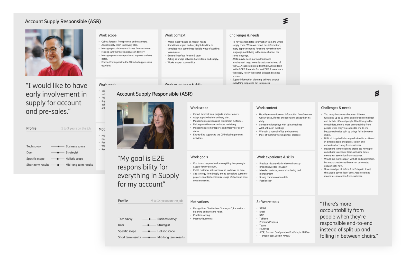
Personas


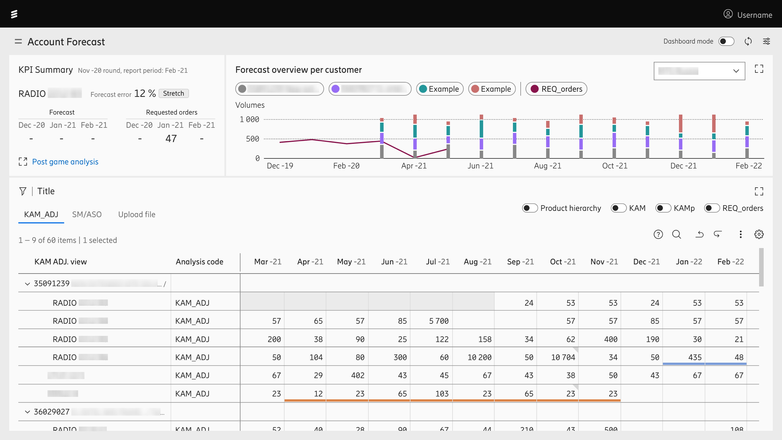
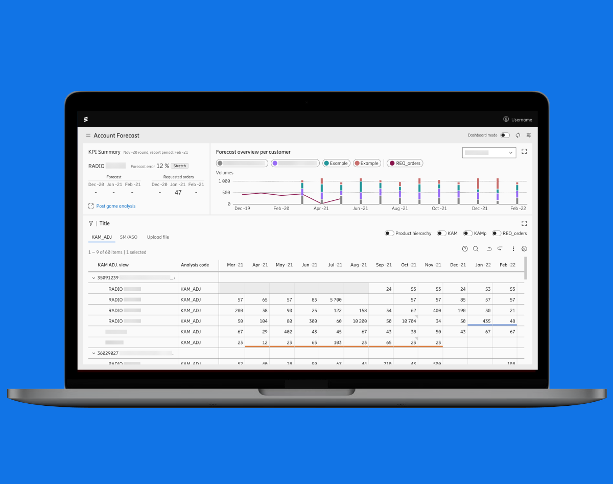
One of the areas our team worked on was Account forecasting, where different job roles/users create and review forecasts of the market demand. This enables users to switch from tedious manual work with Excel sheets floating around and information and data being scattered, to having everything centralised in one place with full visibility and control. The table view is connected to the graph which updates and shows accordingly. There was also a dark mode version of this interface (which I unfortunately forgot to take screenshots of for my portfolio.)

Account forecast


Until the existing cluttered data could be better structured in the future, we helped to simplify and visualise it by using filters to enable users to choose which levels they need visibility of, it also helps filter out unwanted information from the table view.
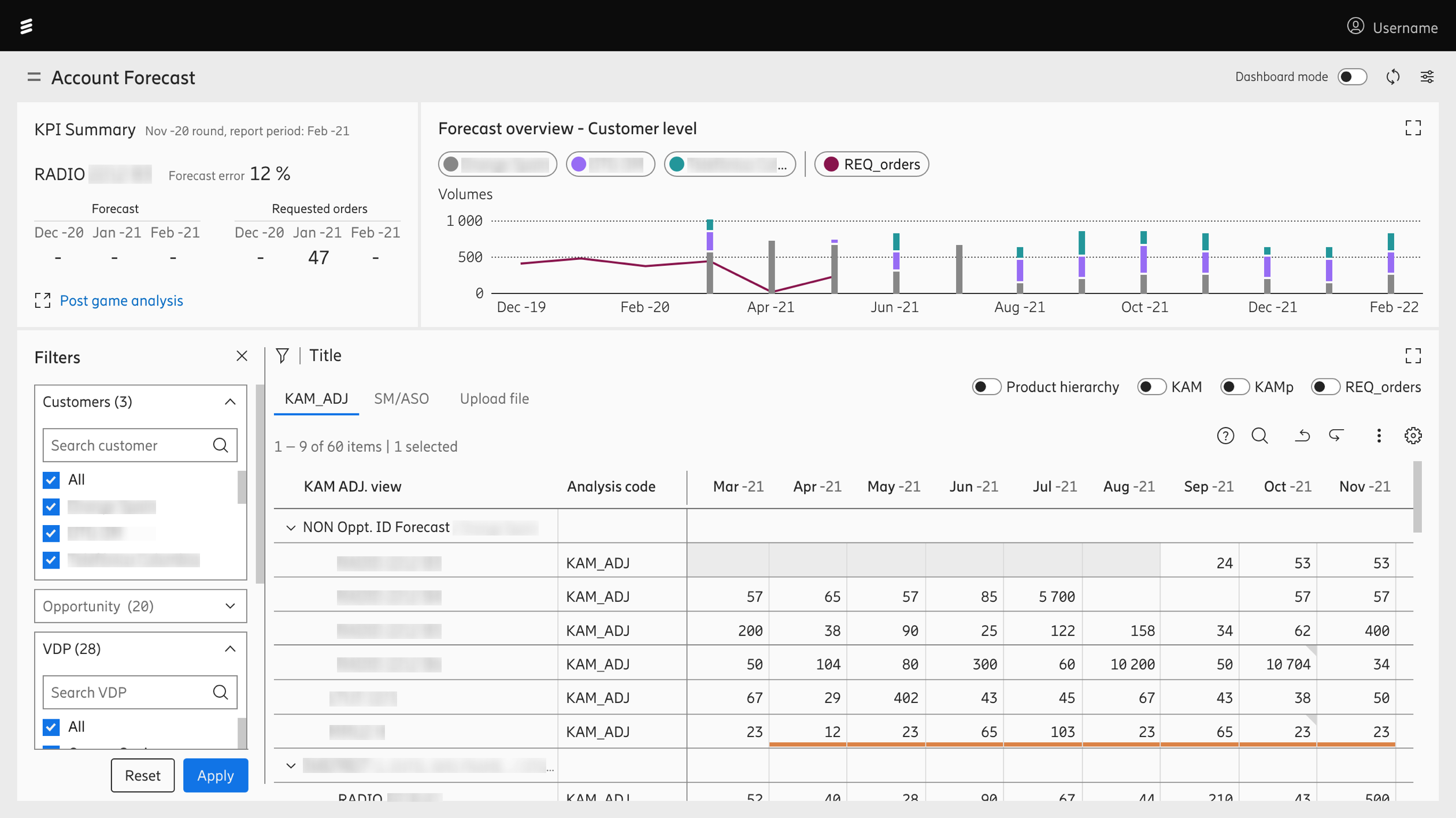
Account forecast with filters open


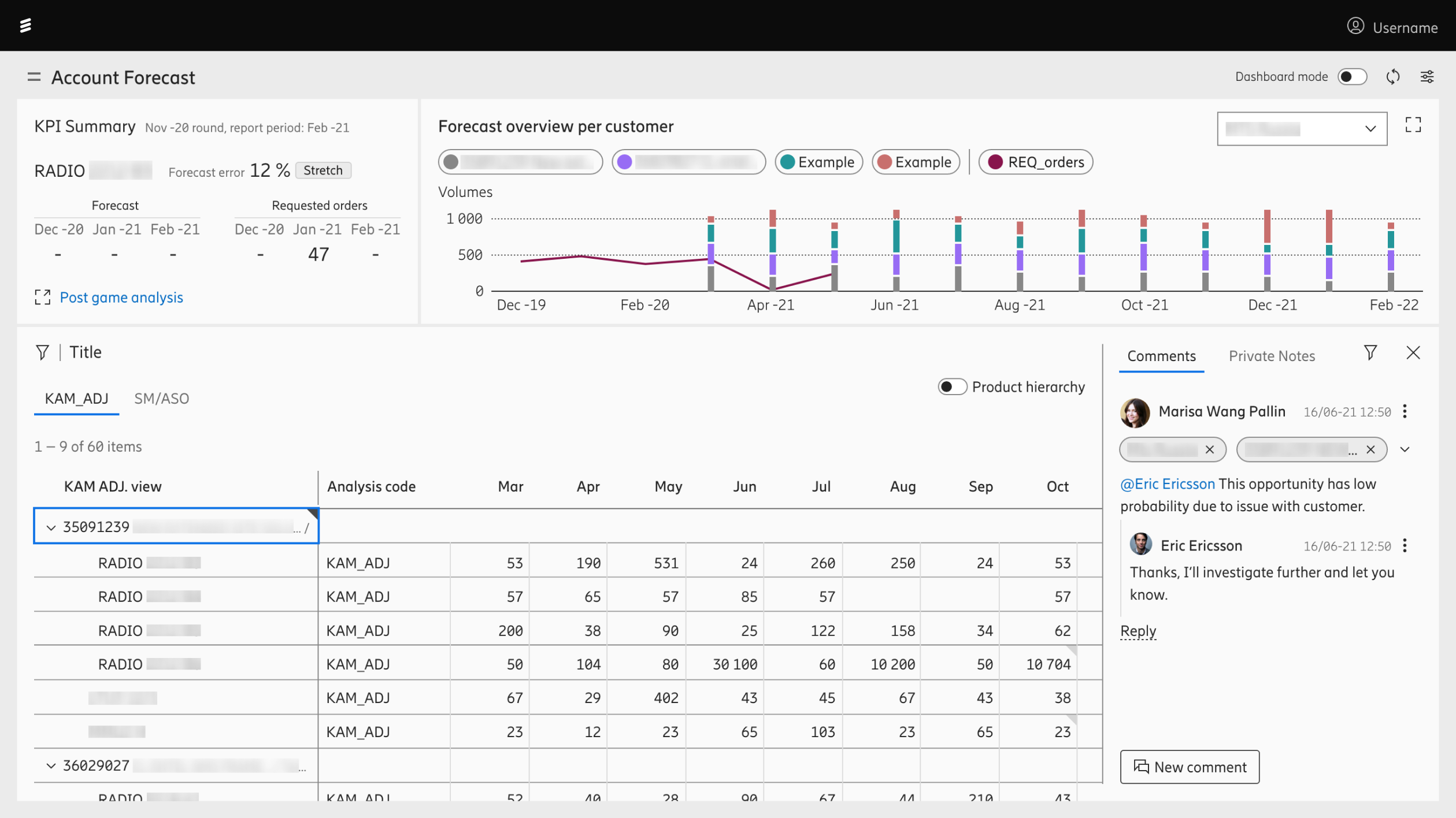
Communication is key as there are different job roles/users that have to cooperate and all over the world. I designed a commenting function that would also have chat possibilities for the table view.

Account forecast with comment panel


Here are some of the last design explorations for the chat function before I left Ericsson. From the left, starting with the simplest version to a full collapsible thread, to adding on tags and breadcrumbs.
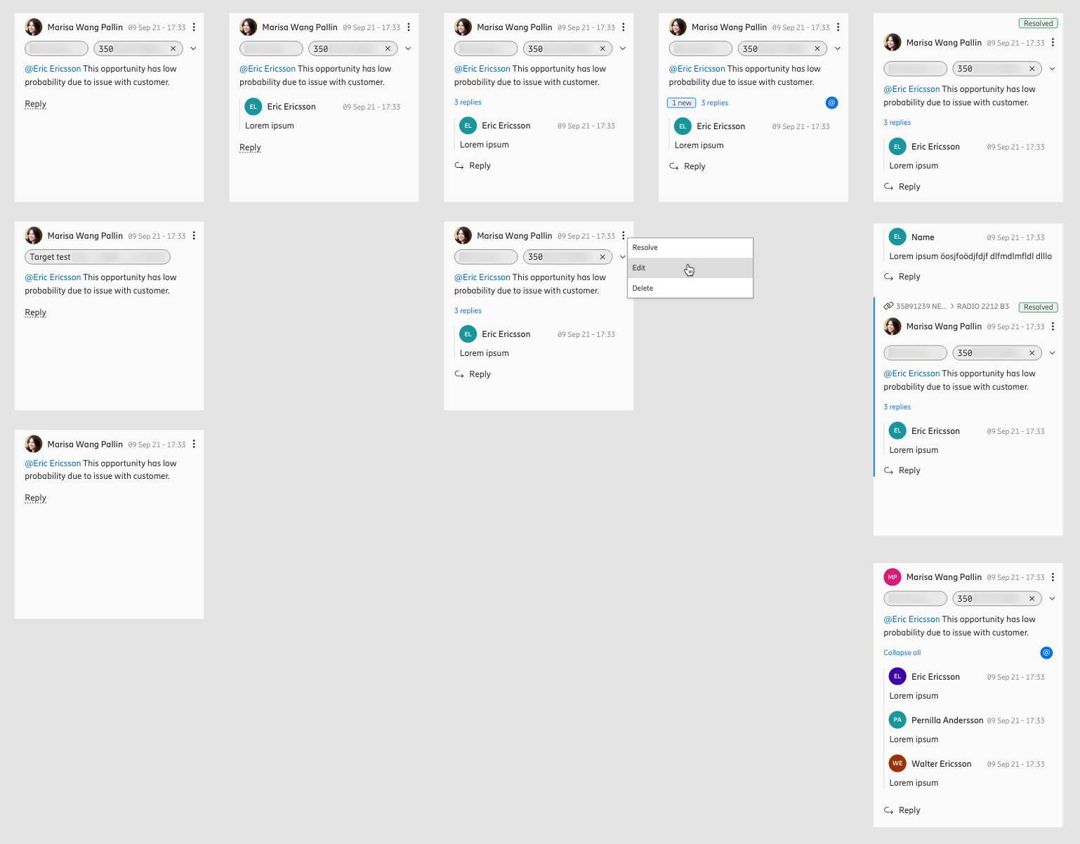
Design explorations for chat function


Kontakt

Marisa Wang Pallin
Email: marisa@spiritarts.net
Tel: +46 (0) 765 63 53 75

Länkar

Portfolio