Fodi is Sweden's first local food store online.
Their goal is to change the way Swedes shop for food. Their major focus is on local
suppliers, personalized service, and environmentally friendly deliveries. As a tech company they use
AI where the store learns their customers' shopping patterns.
Fodi needed help to redesign important parts of their
digital service and also a new design for their website. I worked as a freelance consultant and took part in their first launch which was a big success and they are expanding to more areas in Stockholm.
For the digital service project I collaborated together with a UX lead, PO, developers, and marketing team. In the other part of the project, their website, the responsibility for both UI and visual design was assigned to me. I worked closely with UX lead in discussing and creating user functions, flows, high fi mock ups, overall UI design and graphic assets. There were already some high-level concepts but they were only defined by an art director, so they needed help to transform them to work for app and web. We used the existing design system and symbol libraries.
SERVICES:
UI design
Visual design
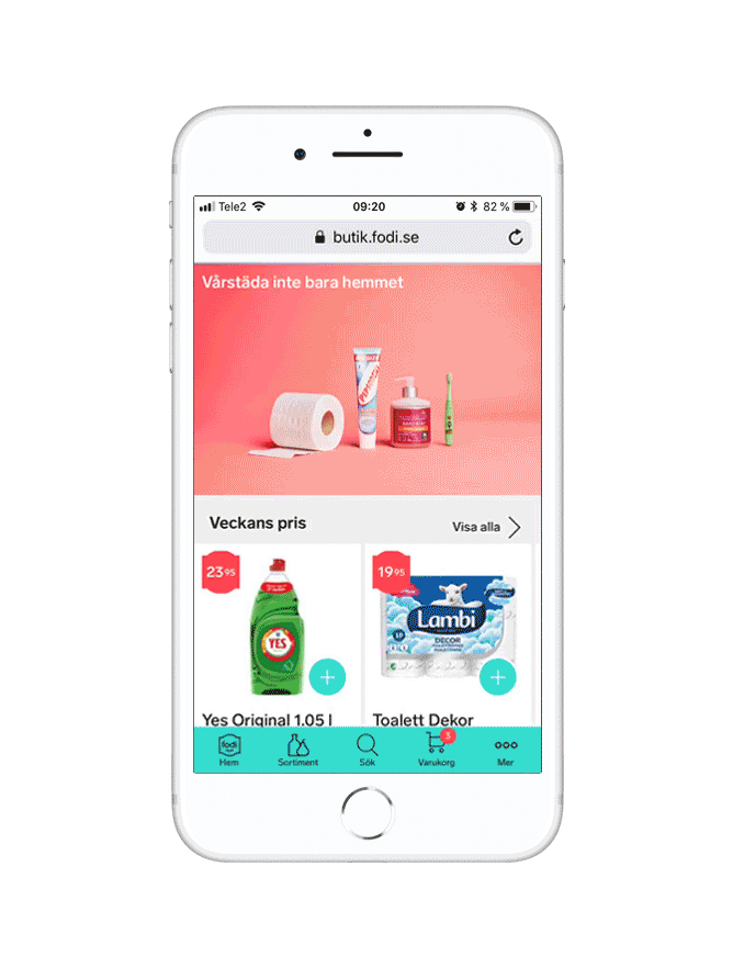
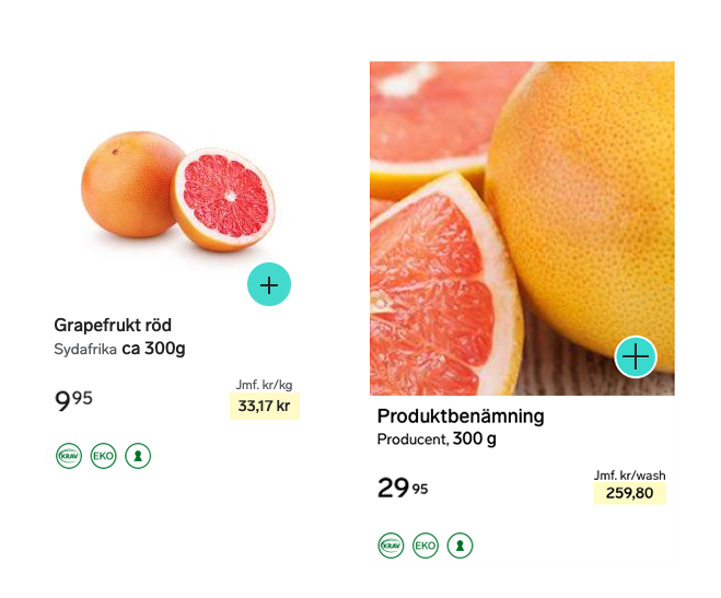
Start page and shopping cart with items.
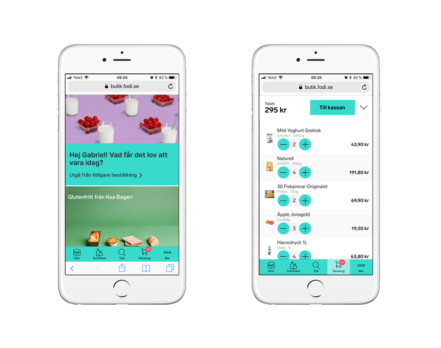
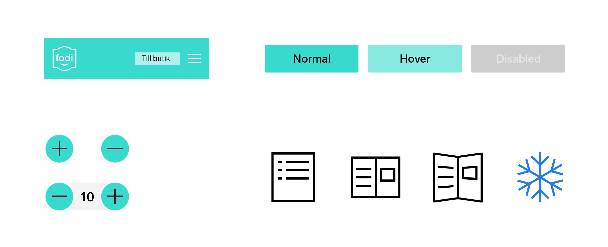
When shopping and scanning around for items, it's essential to have a clear ovierview of the products so as little "clutter" as possible would be ideal while still keeping a hierarchy. One challenge for me was that the existing brand colors and style (which had already been set before I started working there) that caused poor contrast in the icons for add(+) and subtract(-) buttons due to white color being used on top of the turquoise brand color. A few improvements:
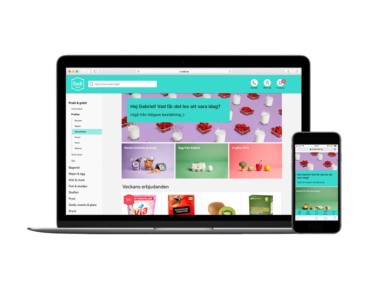
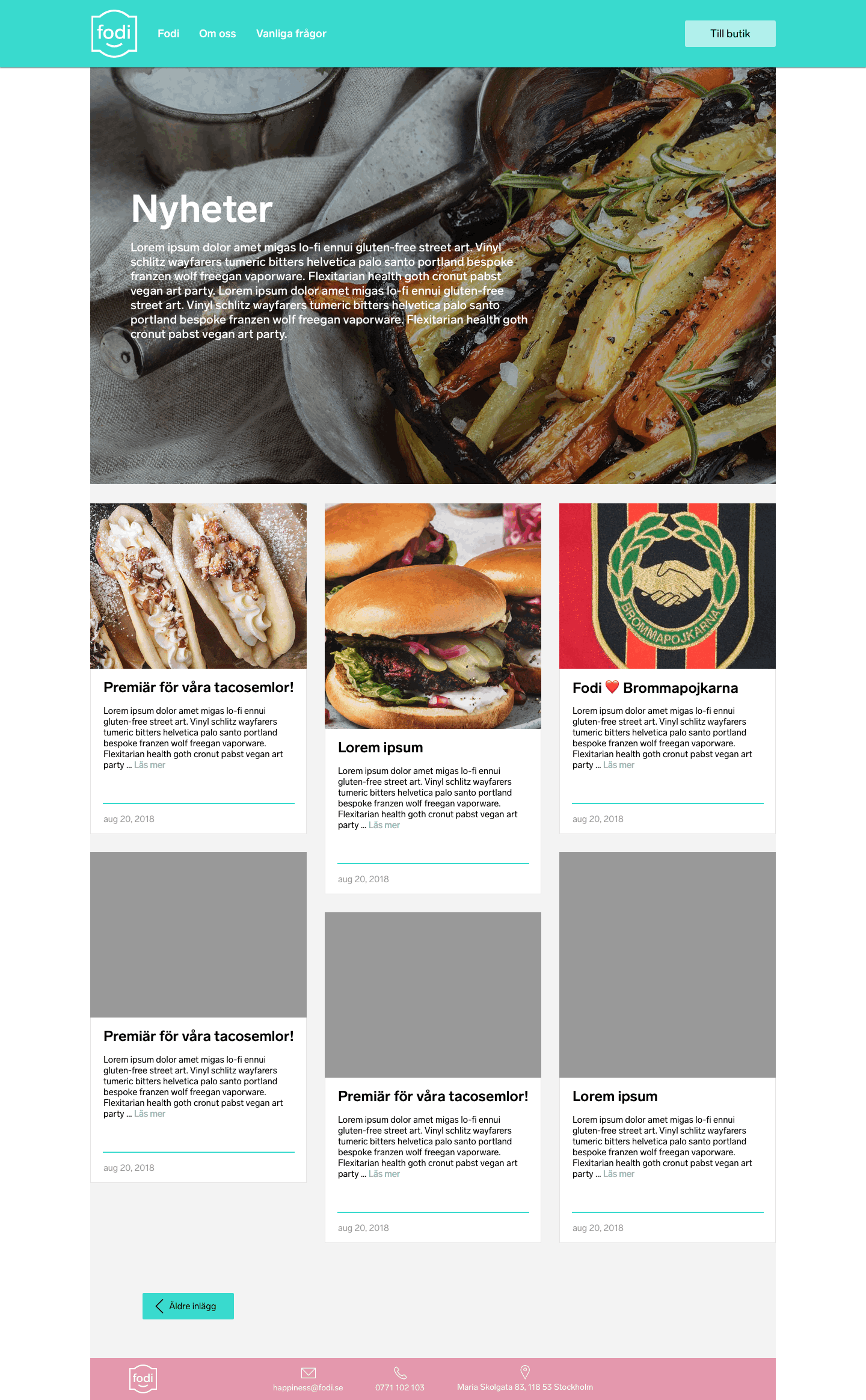
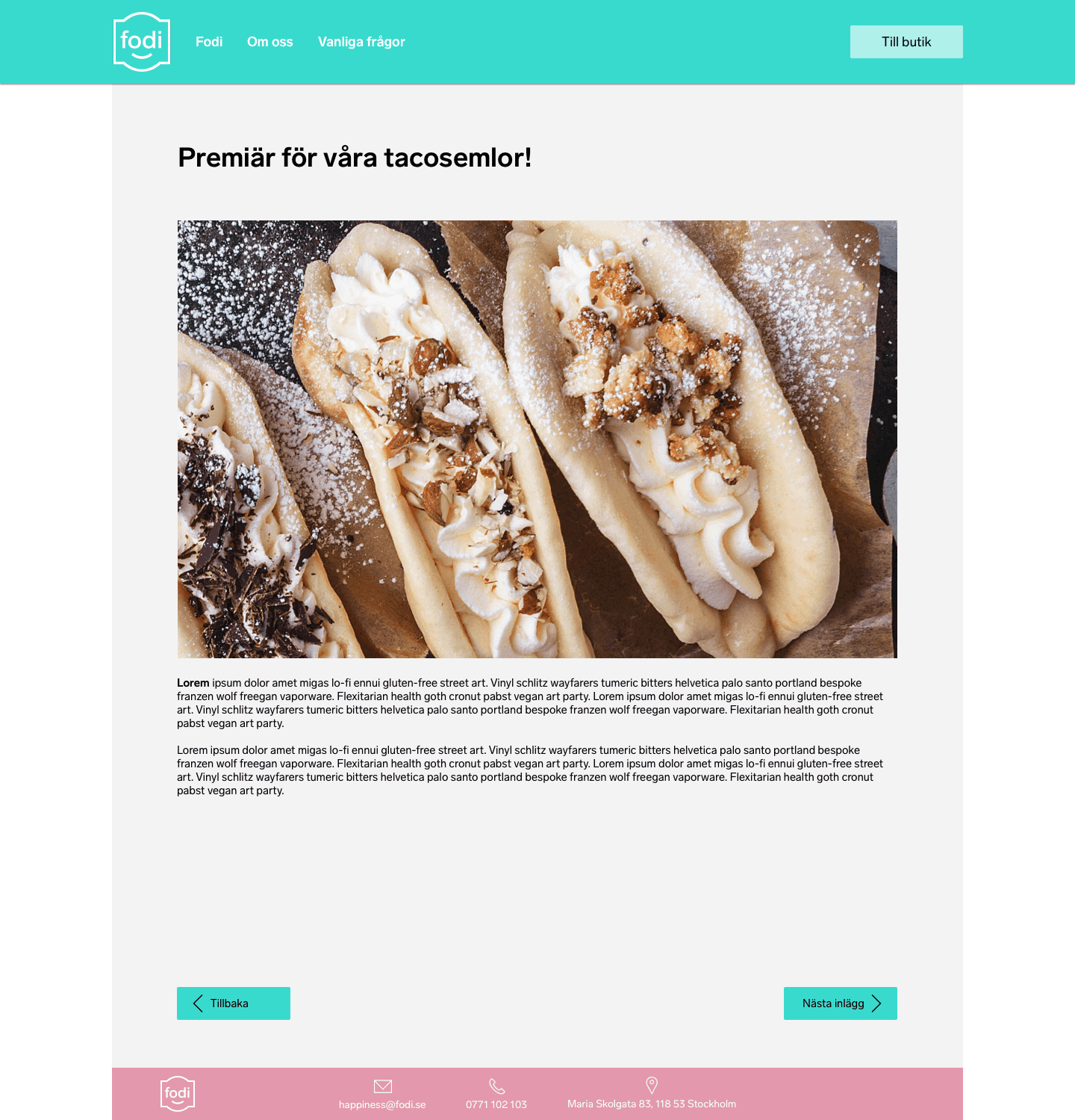
High fidelity mockups for the Fodi website linked to the online store. This page is one of the first encounters for the user and works like a gateway to the store. On the top menu, I placed a button that links to the store for those who already have an account and want to go directly to the store.
Here are a few assets from the design guidelines where I also created additional icons that would match accordingly to Fodi's existing brand guidelines. I worked with their design system and the library features in Sketch.