Reporäntan is an iOS app which helps you keep
track of the Swedish repo rate, and soon there will be more types of rates available on the
app. You can also share information on social media and read news from Riksbanken. Other
features are calender integration and an upcoming quiz/game about rates.
The client
needed help with a complete redesign of the app's UI and graphic identity which looked too
basic and had a poor first impression of quality because it had not been designed by a
professional designer.
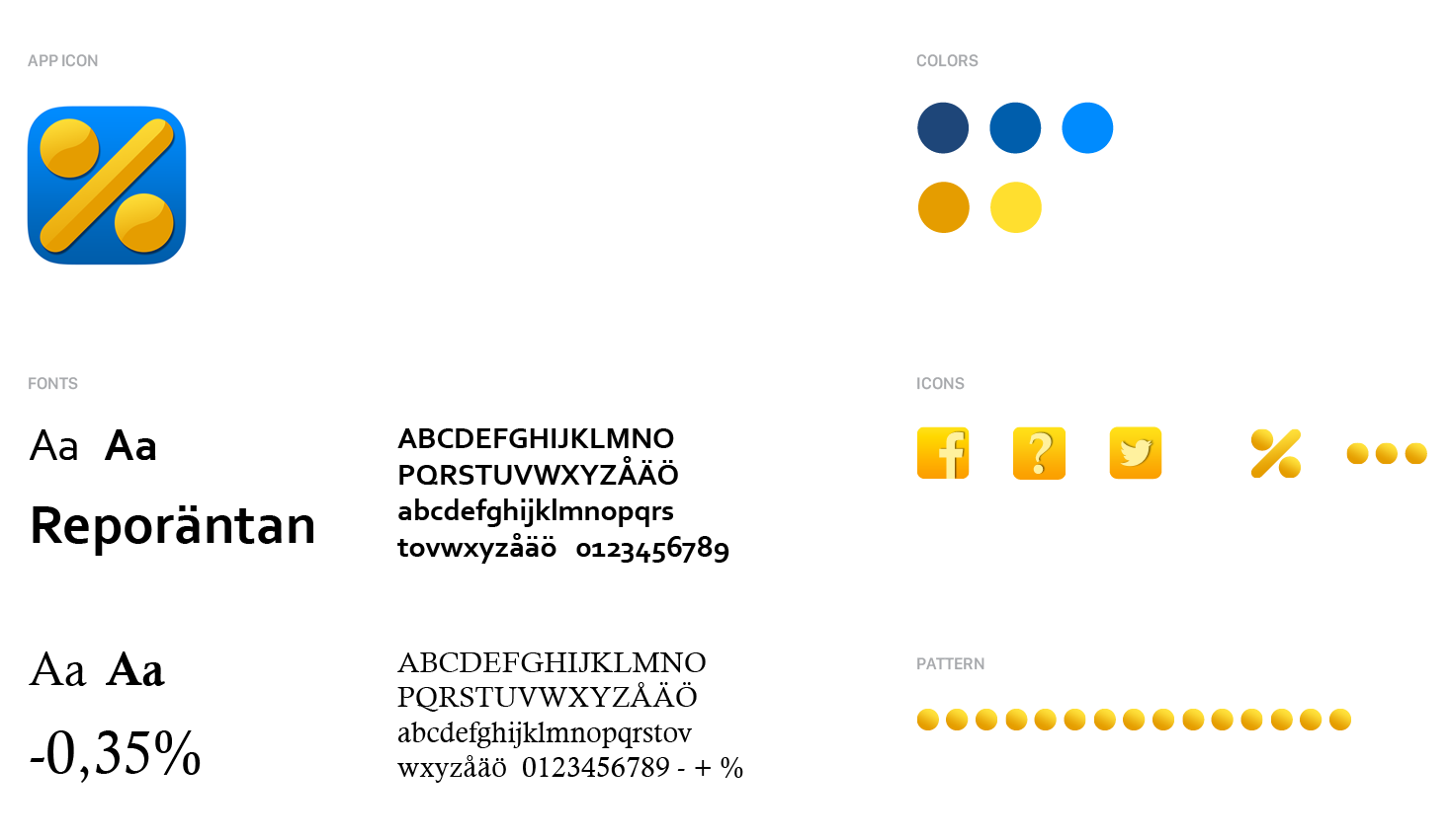
A whole new UI and identity was in need. I started with some research about the target group and the financial services industry which resulted in my conclusion that finance doesn't have to be so stiff and formal as it was in many places, so I strived after a warmer and inviting yet elegant "look and feel" when you enter the app. Golden coins were the common thread I used throughout the identity, and the brand colors became a bit by coincidence very similar to the Swedish flag which was perfect since the app is for the Swedish market.
SERVICES:
UI design
Identity
Art
direction
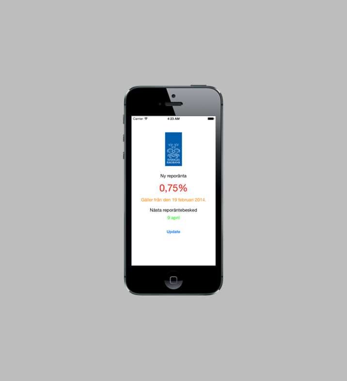
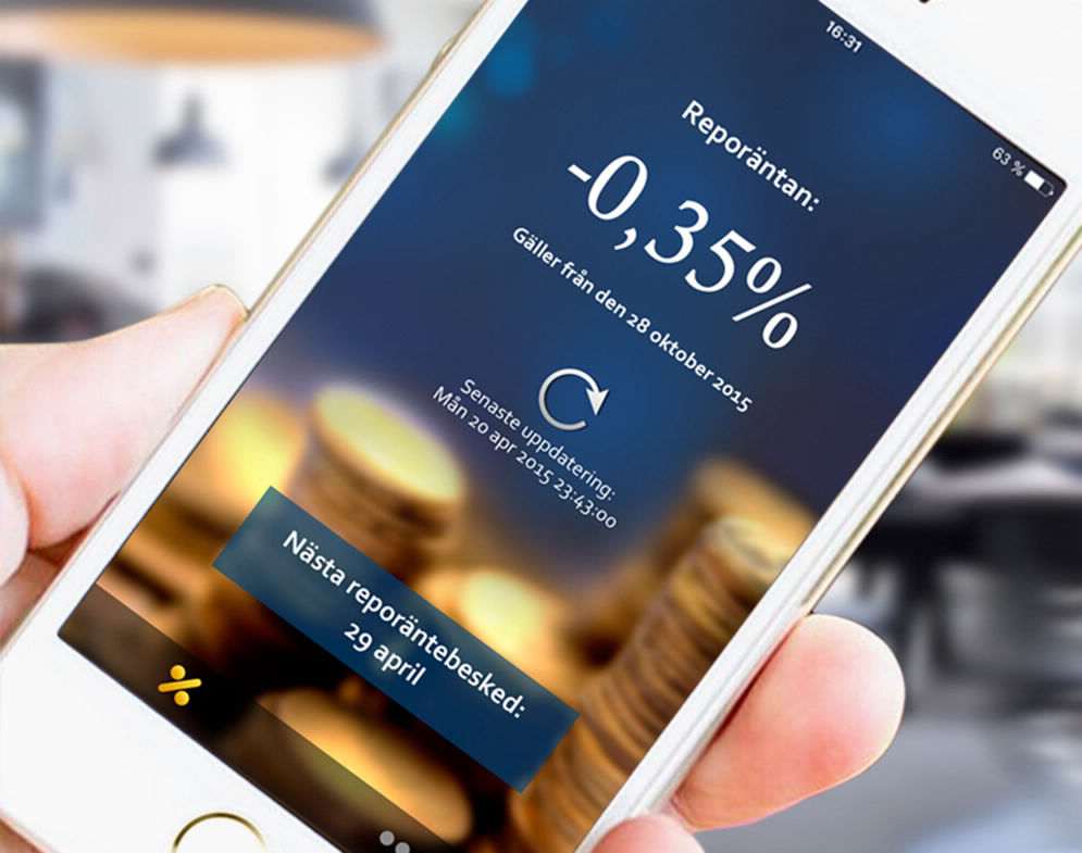
OLD DESIGN
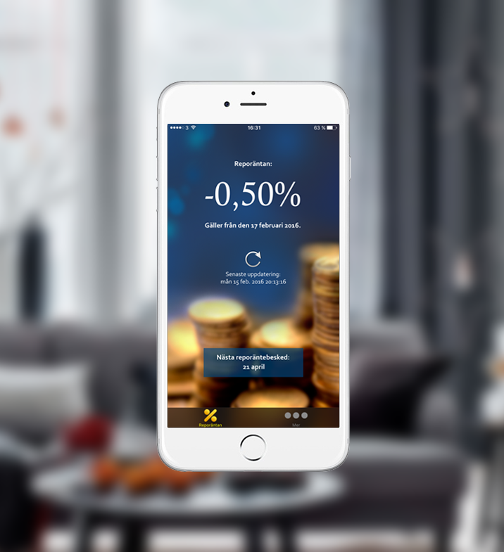
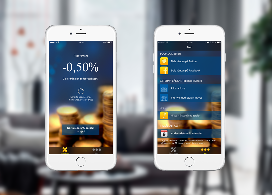
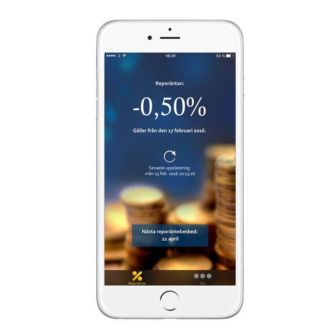
NEW DESIGN